
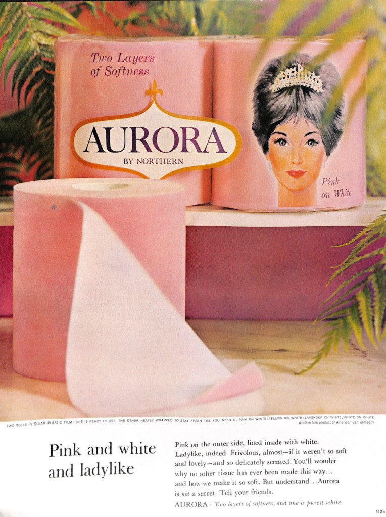
If you thought toilet paper was white, you would be wrong. Northern offered their Aurora double ply toilet paper two-tone in the 1960s. The top ply was pink and the bottom was white. Northern also sold their Aurora brand in yellow, lavender and just plain white. This was according to the above ad from the December 1964 edition of the Ladies Home Journal.
Matching colors was important in the mid-century. When I was a kid growing up in the 1960s, I had an aunt who loved teal. Every item in her house seemed to be teal. When the sun shone through the window, I swear that even the air was teal. This consistent color theme carried in to her bathroom. You guessed it. Her toilet paper was not white. It was a light teal.
Speaking of colorful teal bathrooms, take a look at this ad. It is from American Standard plumbing and appeared in the September 1958 edition of Better Homes & Gardens. That’s a lot of color, but I do love the vase-themed wall paper. Note the design of the toilet. It is made to attach to the wall.
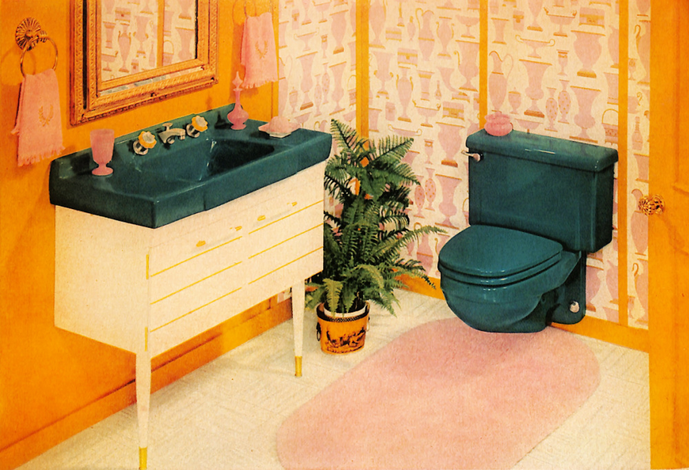
Wouldn’t the pink toilet paper look great in this bathroom?
Here’s the full ad.

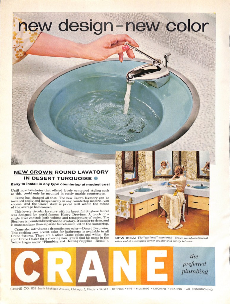
Inspired by the pink toilet paper ad, I thought of the assorted colorful bathrooms that I remember from my childhood. Curious, I sought out more colorful bathroom ads to share from my collection of mid-century women’s magazines. Here are two more colorful mid-century bathrooms.
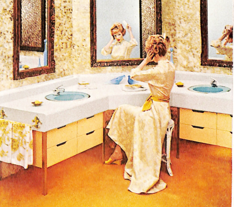
Here’s the full ad.
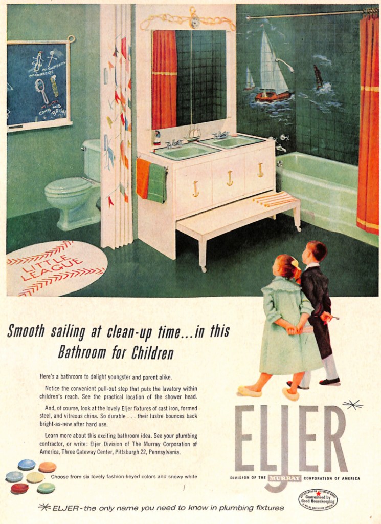
Here’s one more. This sailor-themed one is for kids. It has a rectangle mint-colored double sinks with matching bathtub and toilet. I find the chalkboard next to the toilet interesting. Also interesting is the rolling bench under the vanity.

Pingback: A Vintage Look at 1948 Home Heating Solutions – Mid-Century Page
Pingback: Mid-Century Bathroom Design: More is More – Mid-Century Page